The problem: if consumers can't use it, they won't. That's an important aspect of rolling out a new interactive product, independent of platform (TV, PC, kiosk). If they find they can't use it, they won't come back again later -- even if the product is greatly improved. It will be too late. The fickle consumer remembers first impressions as the long-term perception of the product. One strike, and you're out.
PC companies have learned this the hard way, especially with multimedia upgrades. Ship a difficult product to use and forever be known as having a difficult product. (The same goes for quality!) The personal computer industry heard the message. Preconfigured packages broke through the acceptance barrier. Multimedia upgrade kits bundling all the necessary components, along with a selection of CD-ROM software and kindergarten level instructions, hit the shelves in time for the Christmas 1994 selling season. Consumer sales into the burgeoning home market followed. No chicklet keyboards here. (See how many of you remember the PC Junior!) Second-generation multimedia has arrived, and with it greater simplicity of installation -- plug 'n play -- if not greater ease of use. Now it's time for interactive developers to do the same.
A good example of "usability" is the replacement remote control. Replacement remote controls have found a market in homes where the original sits on a shelf or in a box. Why? They were developed specifically to meet a need, where the original was probably developed as an afterthought to work with the appliance it controls. Look at the original. It's like something from outer space -- so big, with so many buttons, that it looks more like the flight console of the Starship Enterprise or the landing deck of an aircraft carrier. The replacement market is dominated by products with BIG buttons, fewer than the original, placed logically on something that fits nicely in your hand. A key advantage is that the replacement gets rid of the individual cable, TV, and VCR remotes. And most of all, they have a neat little feature called "punch through," which means you can change the channel and volume on the TV and control the VCR at the same time. For cable households, they can press VCR, then TV, then cable, and the channel buttons change the channel on cable box, the volume buttons change the volume on the TV set, and the VCR buttons control the VCR play, stop, fast forward, rewind, and record functions.
Too complicated? Well, my wife's favorite remote is called "The Stick," which looks like its name and has only six buttons: power, channel up & down, volume up & down, and mute. Not fancy, but it gets the job done. She lets the kids work the VCR, and wouldn't think of trying to fire up the home theater system -- which is actually only slightly more complicated to fly than the Starship Enterprise. Oh, she'll snuggle into the overstuffed recliner couch, curl up, and watch Harrison Ford or Kevin Costner act out their heroics in full surround sound including thundering bass from the subwoofer, but she won't go near the massive remote control programmed to control the whole system from its 100+ button keyboard.
This is the conundrum, and the challenge for interactive developers. My wife will enjoy the technology -- once it's turned on and working. She loves the home theater, because there's never anyone blocking her view and she doesn't have to step on sticky things, but the movies look just as good. She'd like it more if she could talk to it and tell it what to do: "make it louder, turn it down, skip this part, turn it off for a while, and switch to my soap opera." Actually, she does have a voice-activated control system -- me! Our next system will have that feature built in, even if I have to develop it myself.
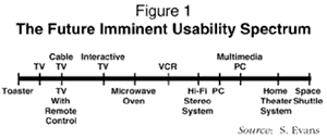
Got the point yet? To be successful, the control process for interactivity has to be extremely usable. The days of the user adapting to the system have passed as products have become more complex. There is a threshold the user can't (or won't) be dragged across (see Figure 1).
FOOLISH INCONSISTENCY IS THE HOBGOBLIN
You know the rest from grade school. Interactive navigation systems and life have something in common. Consistency is the key. That way, everyone knows what to expect. Navigation systems are intended to move the user (think viewer, because broadcast programmers are the true masters) from one place (program) to another without losing them in the transition. Humans are creatures of habit. They are comfortable when things are always in the same place, where they can find them when needed. This holds true for navigation systems. Regardless of the steering mechanism (wheel, tiller, joystick, mouse, remote control), the gas and brake pedals better be in the same place all the time. The human brain remembers all of this, and the reactions become instinctive. In computer terms, this is known as "intuitive" -- moving from one thing to the next because it seems logical, and it feels like the way it should work.
There is a palpable flow to an intuitive system. The transition from one thing to the next feels natural. The feeling of how it should work is directly related to environmental conditioning. When you see something pointing to the right, you don't expect it to take you left or down. When you see a button, you press it to make it work. This is all conditioning or, more precisely, adaptive behavior. The navigation system is such a critical component of interactivity that it should require as little adapting as possible. It should feel right. If it flows, the content becomes the controlling factor. It should all be as easy as watching a show on television, with the remote control in your hand controlling the flow, and no manual dexterity required.
CLARITY COUNTS
This is where clarity takes over. Each item, whether part of the content or the navigation, has to be clearly distinguishable (can you recognize it as soon as you see or hear it?) to the human eye and ear. What it is and what it does must be recognized instantly for the intuitive feel of the system to be maintained. This is where the GUI (graphical user interface) and sound functions of the multimedia environment can fail the interactive developer. In the search for "point-and-click" clarity, the way information is presented must be graphical and audible without becoming overwhelming.
The tendency of the inexperienced developer is to get too cute. Again, use broadcast television as the benchmark. Things are presented simply without being dense. Interactive developers, in an effort to created an immediate visual impact, tend to make the graphics too rich, too striking. The audible content jumps out, jarring the user. This may be acceptable where the duration is short or singular, but when the user will be looking at it repeatedly or for long periods of time, it becomes tiring. The objects become hard to identify, unless they contrast so greatly that they detract from the overall effect. Even worse, objects that come and go confuse the user and disrupt the flow. The model most often used, both good and bad, is MTV. The counsel here is to remember your audience. If that's their style, go for it. But MTV gives most people over the age of puberty a headache when subjected to extended viewing. That's why there's VH-1 for the rest of us.
If the product is a game, these elements can be exciting. Most interactive products in the future, however, will not be games. Games dominate for now, but the market is in other areas that reach much broader demographics. And the interaction will be over a longer period of time. If the presentation or navigation is disorienting or bombastic, the stress factors will become limiting factors. In navigation, this becomes especially important. The technology will facilitate a number of "look and feel" choices. Picking the one that suits the audience is critical. The 3-D animation of a game such as DOOM is fine for a "shoot'em up" action/adventure game. But if the 3-D motion of DOOM is distracting to you, the "full sphere" animation of DESCENT will drive you over the edge. These modes are great for games where realism is important. That's why the joystick is the navigation tool of choice for games. When you're chasing the bad guys or flying something (from a small plane to the Starship Enterprise), the joystick gives you a tactile sensation reinforced by the on-screen motion driven by the navigation system. The "twirl and whirl," fast twitch games excel in this type of thing. This mode does not facilitate clarity. Further, it requires a high level of conditioning to achieve the skill level required to extend the interaction long enough to become enjoyable, something a mass audience may never achieve. In its place, most applications require a more linear structure to involve the user.
Keep in mind the "Future Imminent" philosophy: if you can't reach a broad enough audience to gain acceptance (and make money), then what's the point? There should be some goal that makes it worth doing.
CONVENIENCE ABOVE ALL
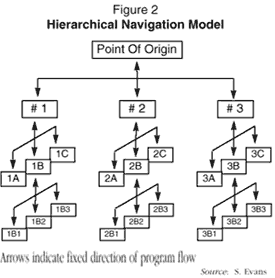
Easy to use is easy to say. It's almost impossible to implement. The convenience factor is the prevailing criteria in determining how the navigation system works. If games are the genré, "twirl and whirl" is fine. Beyond games, the choices become more limiting. Linear modes (i.e., menus) make selection simple, but the hierarchical structure means working through many layers to reach the desired destination. Practical experience has shown that three levels of menus are the span most users are willing to traverse before they tire of the hierarchical search. This limits effective navigation to short spans. Presentation of content becomes either too limited or too cluttered, resulting in loss of consistency, clarity, or both.
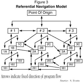
A referential model, based on "hypertext," offers a more flexible form of navigation. Hypertext, for those not familiar with it, embeds additional information into the program content creating a "hot" spot that presents a choice (in both text and graphic formats) to the user. Each choice, when selected, activates a "link," which transitions the program to the destination defined in the link. Once at the destination, the next choice can be made as to where to go and what to do. Going back to where you came from, a common choice, can be facilitated in several ways. Some are provided by the navigation system and others by the content of the program. The interwoven nature of interactive programs blends the navigation system, program content, and presentation method (TV screen, PC monitor, or dedicated kiosk terminal).
The referential model allows choices to be presented and activated in multiple ways. This allows the developer to provide a choice in multiple places. Where and when to present the choice becomes integral to the program flow. If the navigation has been adequately thought out, the program will flow intuitively. If not, the disruption caused by having a choice available will lessen the effectiveness of the presentation. Too many choices also detract by making it difficult to work through the presentation. Many users can't resist the temptation of looking to see what is behind the choice. When implemented properly, this increases the convenience factor because the user is never far from another choice. Many choices can be duplicated and accessed from three places: the program content, the navigation system, and the navigation device (remember our remote control?).
One of the strengths of the referential model is that it almost always provides the user somewhere to go, a way to get there, and a way to get back. That's where the navigation system saves the day. Even if the user gets to a dead end (i.e., one with no exit choices), the navigation system remembers the path taken and provides mechanisms for going back to the previous location, a minimum of one major demarcation point (i.e., a main category entry point), and a direct link all the way back to the beginning of the path. A requirement of a robust navigation system is to remember the route taken throughout the session, thus providing a way to backtrack. Even the best navigation systems will "forget" some of the path detail, based on the user system's resources, but it will remember the main gates (category, demarcation point, etc.). And all navigation systems must have a "home" function that takes the user back to the starting point. The better ones will provide a "bookmark" function that allows the user to save a destination's location so they can go directly back at a future date.
The most widely used version of this navigation mode is on the Internet World Wide Web. The success of the Web as a way to provide access to information is largely dependent on the "browser," which is the navigation tool. Everyone is urged to "surf the net" and become familiar with the World Wide Web. This is good exposure to navigating through a complex environment in a simple manner. Try as many browsers as you can in order to get a feel for the different ways the same information can be accessed. The similarities in functionality will become immediately apparent. It's the subtleties of how each browser is different that distinguish the good ones from those lacking the more elegant features.
Multimedia authoring systems provide many of the same functions, but it's up to the developer to craft the navigation system out of the functions provided in the package. This is what separates the heroes from the villains. Crafting a good navigator is something of a black art, and experience quickly becomes evident. That's what makes the Rule of Three Cs important to those just jumping in.
Much of the interactive development being done today is focused on expanding broadcast programming to include interactive access, bringing mass market appeal in an early timeframe. The simplicity of the remote control as a navigation tool will have a significant impact on how navigation systems are developed, as televisions become more sophisticated and multimedia computers become more usable.
As the audience comes to look more like traditional television viewers, the need to include the full demographic spectrum will drive the navigation of interactive programming to its simplest form. To those of us developing this type of content today, the question asked at every turn is "will Mom use it?" The motivation here is that the market is primarily residential over the long term. Mom controls the home environment, especially in terms of who gets access to the family. The broader range of applications will have appeal for "Mom," especially the areas of shopping (convenience and value) and education. This equates to an audience for programming, and that audience is heavily technology averse. Video games hold a tentative position in the household. Their value as entertainment and acting as an electronic babysitter is offset by their violence and graphic depictions of mayhem.
Capturing the imagination of "Mom" and the rest of the family is highly dependent on two areas: access and programming. Access is getting into the home (whether by cable TV, home computer, broadcast television, or some other means) and the system being simple enough that all of the family is able to use it (a function facilitated by the navigation system). The programs made available for the home must have production values approaching broadcast quality, or they will not find acceptance beyond a hobby level. And navigation is highly dependent on the navigation tool. The remote control remains the basic model, and will remain so for non-computing applications. The introduction of computer pointing devices that act more like remote controls than the traditional mouse has already begun. The absence or acceptance of "joystick" appendages on these devices, including remote controls, will be determined by what the program developers deliver in terms of navigation systems. In the absence of a navigation "standard," the ways to navigate will continue to proliferate. The market, with customers voting by spending their dollars, will determine which systems will survive long enough to become a part of a standard navigation interface. The ones that do will probably have adhered to the basic principles outlined here.